Inheritance diagram for PageControl:

Properties | |
| LONG RW | TabsAlign [] |
| Specifies the tabs position. | |
| VARIANT_BOOL RW | HeaderVisible [] |
| Hides or shows the control's header. | |
| VARIANT_BOOL RW | TabCloseButton [] |
| Applied if close buttons is visible. | |
| VARIANT_BOOL RW | ShowSingleTab [] |
| Applied if the control have only one tab. | |
| VARIANT_BOOL RW | HideClippedTabs [] |
| If "TRUE" then the control hides partially clipped tabs. | |
| VARIANT_BOOL RW | TabsDragDrop [] |
| Allows drag-and-drop reordering of tabs. | |
| IDispatch *R | HeaderColors [] |
| Specifies the color settings for the header. | |
| IDispatch *R | TabColors [] |
| Specifies the color settings for the tabs. | |
| IDispatch *R | CloseButtonColors [] |
| Specifies the color settings for the close button. | |
| IDispatch *R | ChevronColors [] |
| Specifies the color settings for the chevron button. | |
See also the method CreatePageControl of the Frame.
Examples:
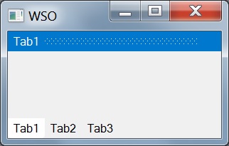
o = new ActiveXObject("Scripting.WindowSystemObject")

o.EnableVisualStyles = true

f = o.CreateForm(0,0,0,0)

f.Text = "WSO"
f.ClientWidth = 200
f.ClientHeight = 100
f.CenterControl()

Tabs = f.CreatePageControl(0,0,0,0)
Tabs.Align = o.Translate("AL_CLIENT")
Tabs.CreateTab("Tab1")
Tabs.CreateTab("Tab2")
Tabs.CreateTab("Tab3")

f.Show()

o.Run()
| IDispatch* R ChevronColors |
| IDispatch* R CloseButtonColors |
| IDispatch* R HeaderColors |
| VARIANT_BOOL RW HeaderVisible |
Hides or shows the control's header.
Default value: "TRUE"
| VARIANT_BOOL RW HideClippedTabs |
If "TRUE" then the control hides partially clipped tabs.
The hidden tabs will be available through the dropdown menu.
If "FALSE" then the control will show all tabs. The tabs can be shrinked if needed. Text on the tabs can be displayed with ellipsis.
Default value: "FALSE"
| VARIANT_BOOL RW ShowSingleTab |
Applied if the control have only one tab.
If "TRUE", then the tab will be visible, otherwise is not.
Default value: "FALSE"
| VARIANT_BOOL RW TabCloseButton |
Applied if close buttons is visible.
If "TRUE", then close buttons will be placed on the tabs.
If "FALSE", then one close button will be placed on the header. This button allows the user to close active tab.
Default value: "FALSE"
| IDispatch* R TabColors |
| LONG RW TabsAlign |
| VARIANT_BOOL RW TabsDragDrop |
Allows drag-and-drop reordering of tabs.
Default value: "FALSE"